i'm trying to illustrate a "J-1" based on terrible quality photographs, mostly using a phonia S-150 as a reference. i've already done a rough test illustration, trying mostly to re-draw the tweeter grid pattern without it causing a "moire pattern", a resolution distortion that turned the original highlights i added to the squares into something like plaid and have redrawn the area from scratch as well as totally squaring my painting instead of trying to match the angles from the reference photo which causes a bunch of annoying problems, especially when getting to re-painting highlights.
there are a few questions about J-1s i can't answer based on the blurry, noisy, lofi pics i could find.
i've already done a test redrawing all of the graphics and finally found out that the font for all of the functions is helvetica. it took a while to find that font after arial was way too light and different to work well and a couple dozen sans serif fonts i downloaded didn't work either. if the boombox doesn't use helvetica, it's something too close to quibble over as small as the text will be. that's also one of the problems i'm having, reading all of the text.
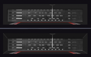
the best i can make out is that the EQ frequencies are:
80Hz, 150Hz, 300Hz, 600Hz, 800Hz, 1.5kHz, 4.5kHz 7kHz, 13kHz, & 16kHz
is that right? if so, it doesn't follow the "octave steps" of most other EQs eg. 1.2kHz instead of 1.5kHz as that's an octave up from 600Hz. i want the illustration to be REASONABLY accurate, but i'll probably be combining elements from different variants. the brand i'll be illustrating will be a tecsonic because i like that name and the logo style best, but i'll be using the red trimmed alarm on the phonia and others instead of the goofy sounding "super jumbo" logo. (sounds like a hamburger combo meal. LOL) i'll also be using the FM, SW1, SW2 & AM band graphics instead of calling AM "MW" & stereo / I (?) mono / II & tape formulation buttons instead of the "disco LED" & beat 1,2, & 3 buttons that the tecsonic uses. i can't quite make the band descrptions, but frequency modulation, short & long wave, and amplitude modulation should be right.
does the function button say AUX/CD? i'm betting that's what it says, but it looks like "CO" in every picture.
the text that's REALLY troubling me is what the white arrows on the left side of the of the radio dial say. the best i can make out is they all read MEGA MULTI 2 (??) i'd appreciate clarification on that.
finally, ONLY on one of the two tecsonic pics i found can i clearly see that the radio dial is set back where it looks 2D on all of the other pics, but if it IS beveled in as seen on the phonia pic, it makes no sense that the dial is "flush" with the top of the window. it'd have to be way in front of the "tuner display". i'm guessing that maybe the poor quality of the pic and terrible reflections on the radio bezel are just obscuring the top of the display with a shadow. the J-1 pic looks like the inside sides go straight back, instead of being angled like my second guess in the pic shown, and that only the bottom edge is angled upwards and the top goes straight back too, or the top & sides are at shallow angles.
and clarication on that and the legends under the tuner would be appreciated. it looks like they read:
POWER, TAPE (something) B & A (standing for "backwards alphabetically" LOL), HIGH SPEED, FM ST, TAPE, STEREO & MONO
finally, i'm guessing that the power & FM LEDs light up red when the power is on. i haven't seen that in ANY pics. the legends & LEDs look obscured by the black trim around the radio dial on a pic of an intersound that's on, so they wouldn't be visible when the radio is viewed straight on as i'm illustrating it. the intersound dial also looks like it goes all the way to the top of the window in front of a top bevel.
sadly, all the pics of the JVC RC-M90 i'd rather use (i turned buying a J-1 variant down to replace my lasonic TRC-935 that was stolen down because it showed poor quality control, namely the droopy B deck as seen on EVERY box, and the sloppy bottom row of the tweeter pod squares that stick out like a sore thum to these artist eyes... i'll be "upgrading" my illustrion with "perfect uniform squares") are even worse quality. that, and it's be a nightmare to draw the VU meter graphics and knob markings because of all of the angles.
any clarification you can give on the details i can't make out in any of the low quality pics i could find would be greatly appreciated.
there are a few questions about J-1s i can't answer based on the blurry, noisy, lofi pics i could find.
i've already done a test redrawing all of the graphics and finally found out that the font for all of the functions is helvetica. it took a while to find that font after arial was way too light and different to work well and a couple dozen sans serif fonts i downloaded didn't work either. if the boombox doesn't use helvetica, it's something too close to quibble over as small as the text will be. that's also one of the problems i'm having, reading all of the text.
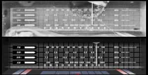
the best i can make out is that the EQ frequencies are:
80Hz, 150Hz, 300Hz, 600Hz, 800Hz, 1.5kHz, 4.5kHz 7kHz, 13kHz, & 16kHz
is that right? if so, it doesn't follow the "octave steps" of most other EQs eg. 1.2kHz instead of 1.5kHz as that's an octave up from 600Hz. i want the illustration to be REASONABLY accurate, but i'll probably be combining elements from different variants. the brand i'll be illustrating will be a tecsonic because i like that name and the logo style best, but i'll be using the red trimmed alarm on the phonia and others instead of the goofy sounding "super jumbo" logo. (sounds like a hamburger combo meal. LOL) i'll also be using the FM, SW1, SW2 & AM band graphics instead of calling AM "MW" & stereo / I (?) mono / II & tape formulation buttons instead of the "disco LED" & beat 1,2, & 3 buttons that the tecsonic uses. i can't quite make the band descrptions, but frequency modulation, short & long wave, and amplitude modulation should be right.
does the function button say AUX/CD? i'm betting that's what it says, but it looks like "CO" in every picture.
the text that's REALLY troubling me is what the white arrows on the left side of the of the radio dial say. the best i can make out is they all read MEGA MULTI 2 (??) i'd appreciate clarification on that.
finally, ONLY on one of the two tecsonic pics i found can i clearly see that the radio dial is set back where it looks 2D on all of the other pics, but if it IS beveled in as seen on the phonia pic, it makes no sense that the dial is "flush" with the top of the window. it'd have to be way in front of the "tuner display". i'm guessing that maybe the poor quality of the pic and terrible reflections on the radio bezel are just obscuring the top of the display with a shadow. the J-1 pic looks like the inside sides go straight back, instead of being angled like my second guess in the pic shown, and that only the bottom edge is angled upwards and the top goes straight back too, or the top & sides are at shallow angles.
and clarication on that and the legends under the tuner would be appreciated. it looks like they read:
POWER, TAPE (something) B & A (standing for "backwards alphabetically" LOL), HIGH SPEED, FM ST, TAPE, STEREO & MONO
finally, i'm guessing that the power & FM LEDs light up red when the power is on. i haven't seen that in ANY pics. the legends & LEDs look obscured by the black trim around the radio dial on a pic of an intersound that's on, so they wouldn't be visible when the radio is viewed straight on as i'm illustrating it. the intersound dial also looks like it goes all the way to the top of the window in front of a top bevel.
sadly, all the pics of the JVC RC-M90 i'd rather use (i turned buying a J-1 variant down to replace my lasonic TRC-935 that was stolen down because it showed poor quality control, namely the droopy B deck as seen on EVERY box, and the sloppy bottom row of the tweeter pod squares that stick out like a sore thum to these artist eyes... i'll be "upgrading" my illustrion with "perfect uniform squares") are even worse quality. that, and it's be a nightmare to draw the VU meter graphics and knob markings because of all of the angles.
any clarification you can give on the details i can't make out in any of the low quality pics i could find would be greatly appreciated.

")

